
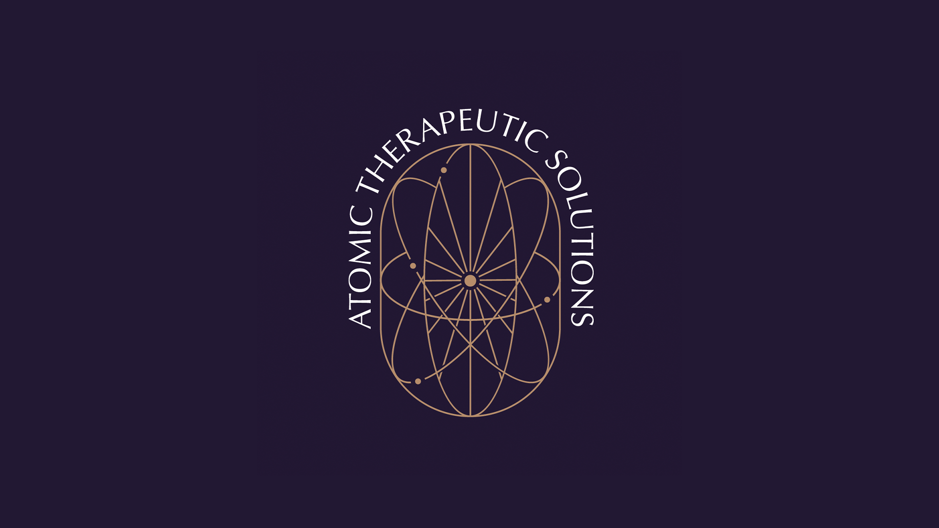
Atomic Therapeutic Solutions
In the last six months, my friend Elly became a licensed acupuncturist and massage therapist. Following her entrepreneurial spirit, she started her own wellness business and approached me to help with a new branding/logo.
Atomic Therapeutic Solutions is a wellness studio focusing on a steady path to healing using traditional Eastern methods. Rather than a quick remedy, ATS prefers the 1% method; gradually getting better by one-percent daily to develop a more permanent health outcome.
Most wellness places that offer acupuncture are often acupuncture first, and anything else second. "Atomic" is a name that seeks to offer several wellness options of equal importance. Atoms in themselves, are tiny. However, an accumulation of atoms can create a powerful change (referring back to the 1% method above).
Elly tended to be more drawn towards a line-art, boho-style aesthetic that we made as our baseline. I decided I would make an image of electrons orbiting a nucleus, in the shape of a pill (playing off of Western pharmaceutical medicine) to tie both name and intent together. A serif typeface was included to give it some level of sophistication while not coming across as intimidating and stuffy.
Overall, I was blessed with a patient client who knew what she wanted and gave plenty of detailed ideas and feedback that made this process easy. When we arrived at the finish line, we were both very happy with the results!


