Between the Steins
(2026)
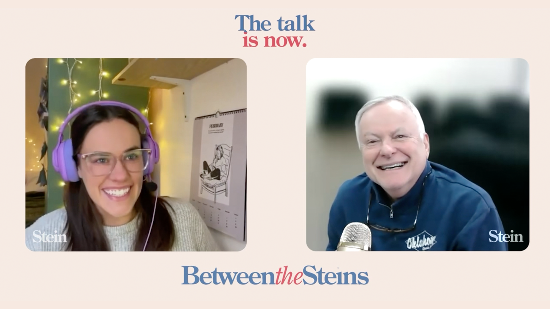
My close friend, Patty Stein, reached out to me for assistance with the branding of her passion project, a podcast called "Between The Steins." In this podcast, a conservative boomer dad (from Generation Jones) and his liberal millennial daughter discuss politics and life. Since I had never worked on a podcast before, I was excited for the challenge.
One thing that is prevalent in most podcasts is the pictures of the host in some capacity. Since Larry (Patty's father) lives in OKC, and Patty herself is based in London, I thought it would be difficult to get photos that matched, given the timeframe allowed for the branding to be completed and the first episodes to premiere. We nixed the idea. Inspiration was drawn from candid moments featuring past presidents with their real daughters. However, given the current political climate and the polarization of the last 20 years, people may struggle to separate the political figure from the father figure. We crossed that idea out as well. Patty did provide archival imagery in iconic moments of modern presidents that I thought really killed it. We found a start!
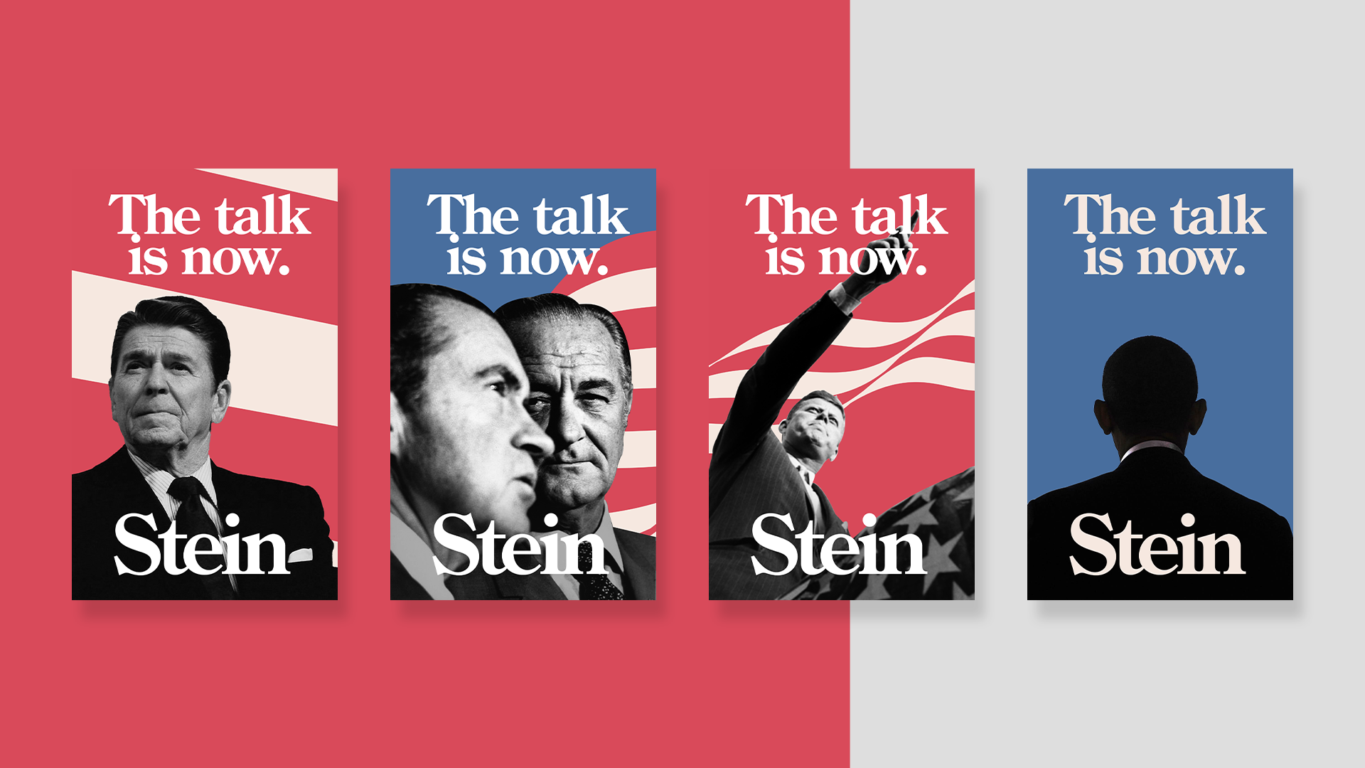
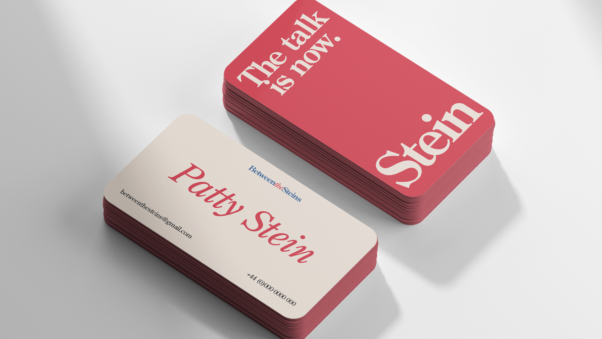
During the discovery, I came across Ronald Reagan's 1980 print campaign. Although he may have been a catalyst for modern wealth inequality, corporate greed, and one of the most harmful figures in Black American society post Jim Crow, his posters and the nostalgic visual appeal were ELITE. "The talk is now" is merely a play off of his campaign slogan "The time is now". The goal of this direction was to evoke nostalgia for boomers through references to his earlier campaigns via typefaces and slogans, while also revitalizing interest for millennials and Gen-Z with big colors in a brutalist aesthetic.
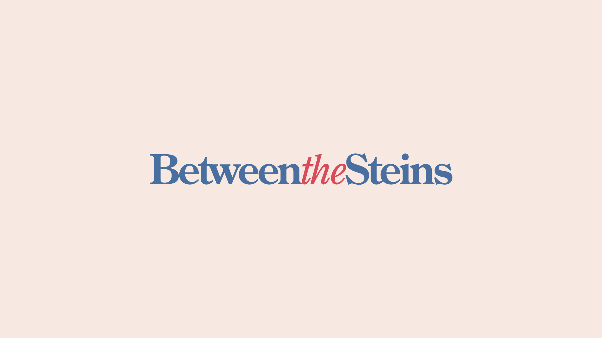
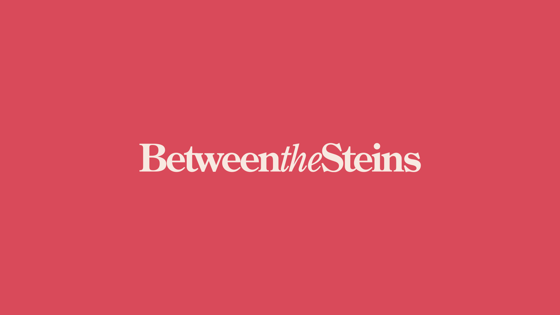
Other marks presented relied heavily on various graphic approaches, but this one had a level of seriousness and professionalism that surpassed the rest. The typeface we used, Century Old Style, is the same one featured in those retro Reagan posters. We wanted to incorporate red, white, and blue colors, but I preferred to avoid being too obvious. Instead, we chose softer, muted tones and replaced the white with a cream color. More professional. More gender neutral.
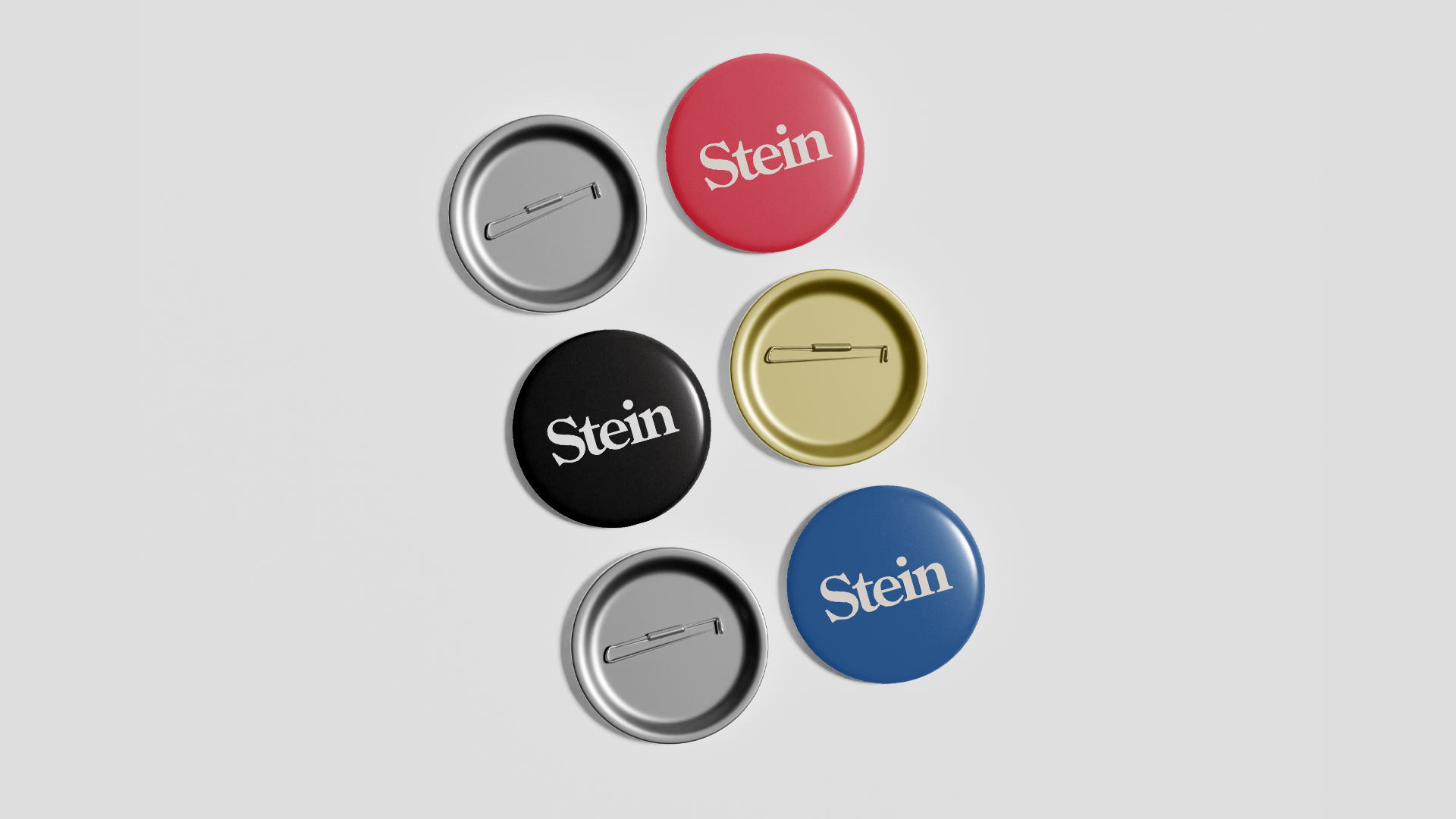
The standalone "Stein" is a call-back to Larry's professional branding —as he serves as the Oklahoma County Assessor. If you have ever owned a home in Oklahoma County, you've likely seen it on a letter in your mailbox at some point.
Episodes drop this April. Available wherever you get your podcasts!